The Challenge: Establishing a New Identity in a Global Context
In 2023, Kenvue was officially launched as a new, large independent company, separating from the Johnson & Johnson Consumer Health division. During such a delicate transition, every department had to redefine its processes and, above all, its visual and communication identity, all while maintaining flawless global operations.
In this context, I was contacted by the Real Estate Management department, a strategic team responsible for managing all of Kenvue's production sites and offices worldwide. Their challenge was threefold:
Lack of Consistency: Internal and external presentations were chaotic and not aligned with Kenvue's new brand identity, creating an unprofessional and fragmented image.
Communicating a New Framework: The team was launching a new internal work framework called "IDEA," but it lacked a visual identity, running the risk of being perceived as a secondary and unimportant initiative.
Complex and Inaccessible Data: The team managed a vast amount of data on its global sites (costs, square footage, maintenance), but struggled to visualize it clearly to make strategic decisions, relying on complex and unintuitive reports.
The objective was therefore to create a coherent visual communication system, give an identity to a strategic process, and begin to bring clarity to their business data.
The Process: A User Experience-Driven Approach
Although the project seemed to be primarily about graphic design, I immediately applied my UX-based methodology, always starting with the "why" and the "who."
Phase 1 - Discovery & Stakeholder Interviews: I began with a series of interviews with the department managers to deeply understand their needs. Who was the audience for their presentations? What was the key message of the "IDEA" framework? What decisions did they need to make by looking at the site data? This allowed me to design with a clear purpose, rather than working blindly.
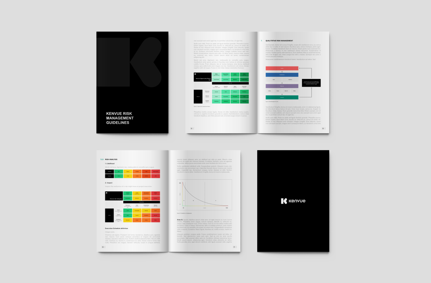
Phase 2 - Creating the PowerPoint Design System: Based on the new Kenvue brand guidelines, I designed and developed a complete Design System within PowerPoint. This was not just a template, but a true system of reusable components: predefined layouts, a color palette optimized for readability, hierarchical text styles, and a library of custom icons.
Phase 3 - Brand Identity for "IDEA": For the "IDEA" framework, I conducted a workshop with the team to define its core values. From there, I developed a logo and visual identity that communicated innovation, process, and clarity, making the framework instantly recognizable and authoritative within the company.
Phase 4 - Collaboration on the Power BI Dashboard: This was my first, crucial experience with Power BI in a corporate context. I supported the Business Intelligence team not so much on the technical development, but by contributing my expertise as a UX Designer. My role was to translate user needs into an intuitive layout. I worked on choosing the most suitable charts, establishing the information hierarchy, and designing a navigation experience that would allow managers to find the answers they needed simply and quickly.
The Final Solution: A Coherent Communication Ecosystem and the Start of a Specialization
The impact of my work was tangible on multiple levels, transforming the way the team communicated both internally and externally.
Efficiency and Professionalism: The PowerPoint Design System allowed the team to dramatically reduce the time spent creating presentations, while ensuring a level of consistency and professionalism that was previously lacking. This strengthened the department's perception as a strategic and organized entity.
Adoption and Recognition: The visual identity created for the "IDEA" framework facilitated its internal adoption. A well-presented process is perceived as more important and is taken more seriously.
The Birth of a Vision: My collaboration on the Power BI dashboard, albeit from a design perspective, was a turning point. It demonstrated to the client (and to myself) the incredible value that comes from uniting data analysis with human-centered design. We created a tool that was not only technically correct but also genuinely usable. This experience was the spark that drove me to specialize in Data Design, connecting all the dots of my professional journey.
PowerBI Dashboard
Let's talk about your project
Have an idea or a challenge to solve? Tell me about it, and I'll personally get back to you.